Barkom
In-Store Poster Design
I designed a series of new posters to be displayed in-store, aligning closely with the brand’s identity while refreshing its visual presence. Using the brand’s typography, imagery from a branded photoshoot, and company slogans, I created designs that emphasized consistency across touchpoints while elevating the overall style. The posters highlighted the brand’s family-oriented values and focus on fresh food, ensuring they felt both welcoming and visually engaging to customers.


Promotional Banner
I created a large-scale promotional banner that combined product photography with bold typography to clearly highlight price discounts and attract customer attention. Consistency with the company’s colors, typefaces, and overall brand style was a key priority, ensuring the design felt aligned with existing visual identity. Because the banner was intended for outdoor use, I focused on legibility and visual impact at a distance—using clear hierarchy, strong contrast, and balanced composition to make the message both eye-catching and easy to read.

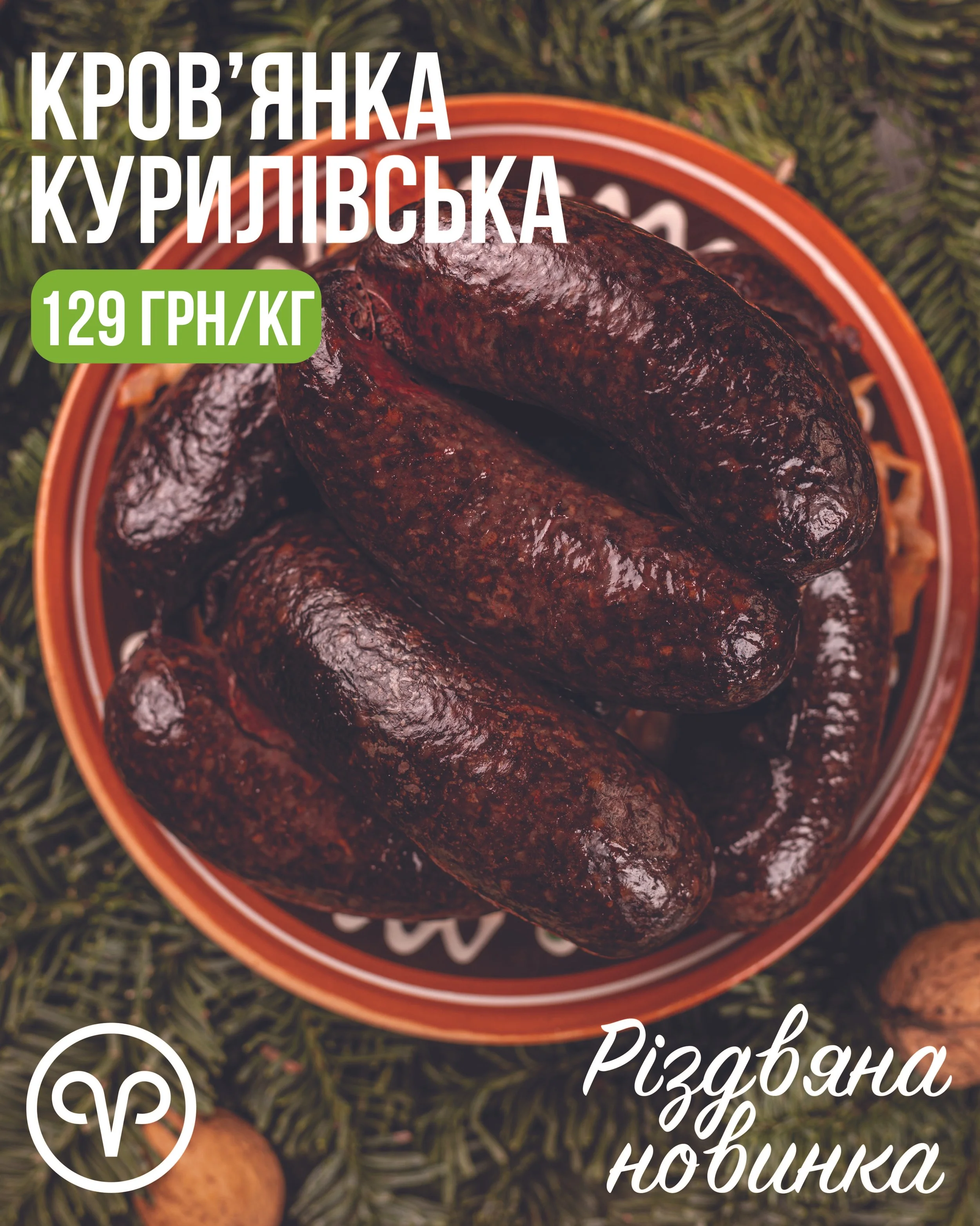
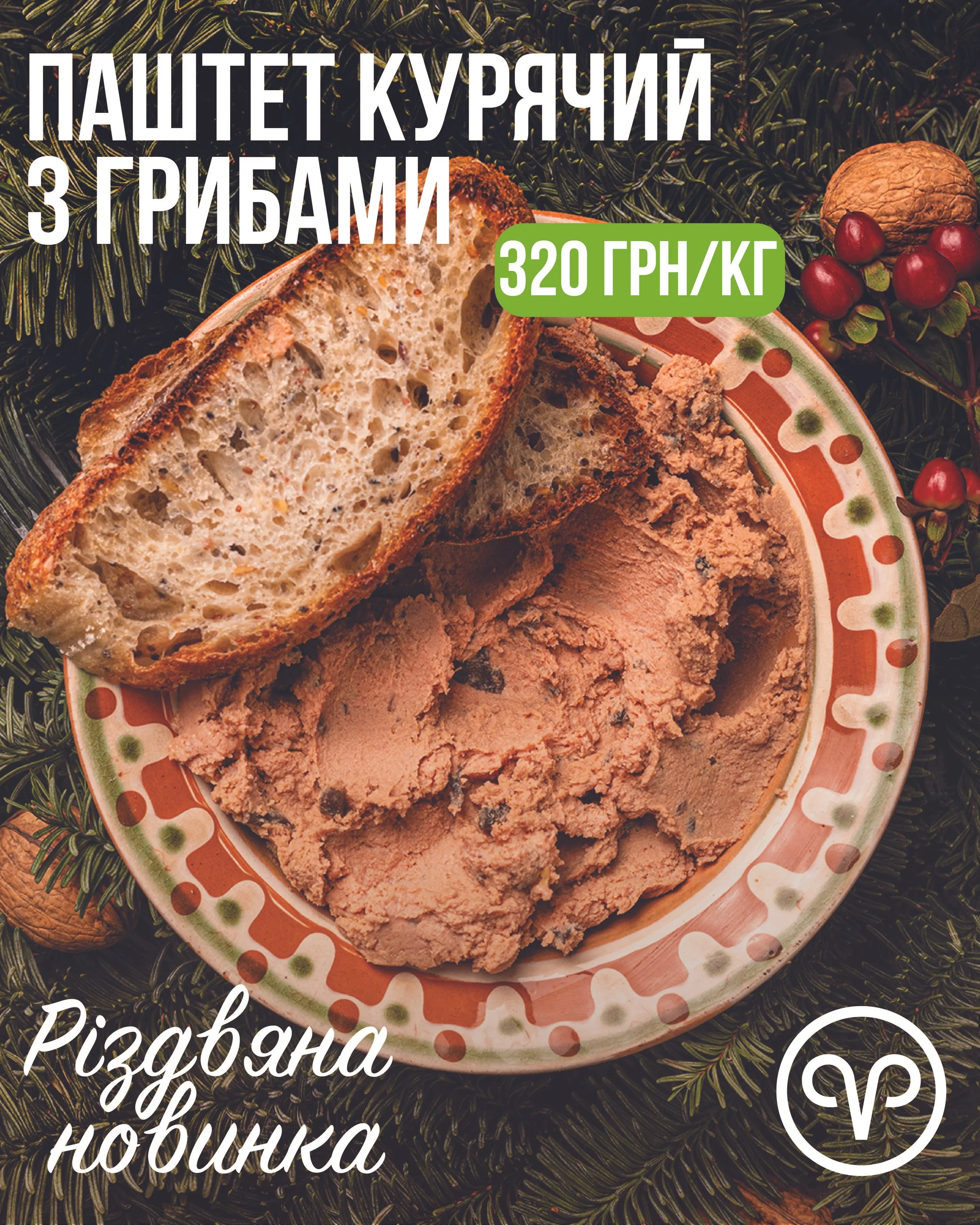
Christmas Campaign
I designed a Christmas-themed Instagram post to promote the brand’s new limited-edition products. Using a festive color palette, seasonal product photography, and subtle holiday-inspired elements, the design created a warm and celebratory atmosphere. I applied a clear visual hierarchy to highlight product details and pricing, ensuring the content was both engaging and easy to navigate within the fast-paced social media environment. The final post balanced holiday charm with brand consistency, making the promotion festive yet on-brand


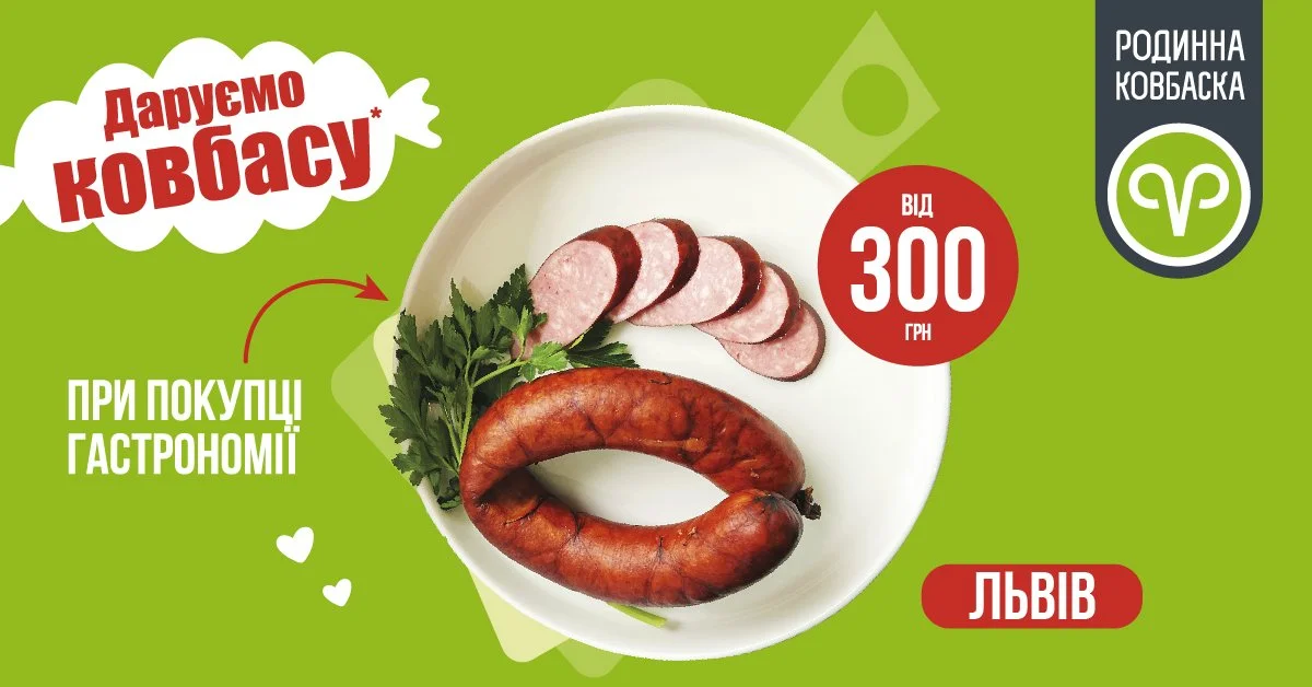
Google Display Ads Campaign
For this project, I created a set of Google ad graphics for Rodynna Kovbaska, adapting a single promotional campaign across multiple ad sizes and formats. The main challenge was to keep the messaging, branding, and visual consistencyintact while reworking the layout, hierarchy, and composition to fit each required dimension. The ads promoted a special offer (“Даруємо ковбасу”) and included brand visuals, product photography, and key text elements.


Promotional Flyers
I designed a series of printed promotional flyers highlight the brands seasonal product discounts. The flyers showcased a selection of sausages, ham, and deli items on sale, with a clear emphasis on pricing, discounts, and product variety.


